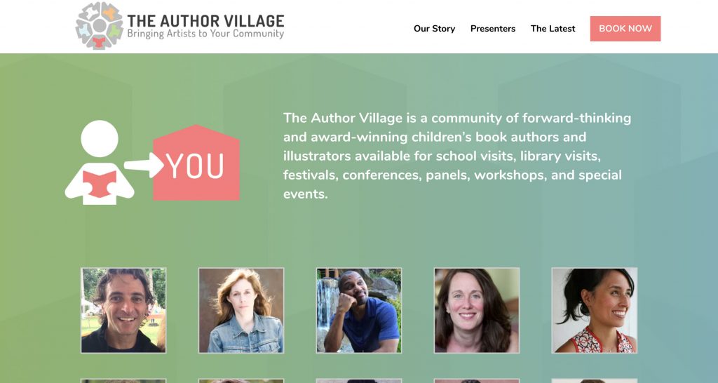
Get Inspired By The Design Of The Author Village
Phil Bildner is one of our favorite people.
We have worked with him for many years, and his lively energy is super inspiring. And he puts that energy to good effect! During his eleven years as a teacher in New York City, Phil got creative incorporating the arts into his curriculum. Now, he’s a full-time children’s book author and presenter. And he’s super awesome at it!
We are so psyched for Phil’s new project, The Author Village — a service that connects lots of talented children’s book writers and illustrators with community programs. It is an honor to help him grow, along with all the authors and creators involved so far.

Phil has assembled an impressive roster of presenters:
- Elizabeth Acevedo
- Derek Anderson
- Laurie Halse Anderson
- Lauren Castillo
- Matthew Cordell
- Mike Curato
- Brendan Kiely
- Kevin Lewis
- Alexander London
- Loren Long
- Meg Medina
- LeUyen Pham
- Lauren Snyder
- Ibi Zoboi
- …And the list is still growing!
Anyway, now that you know what the Author Village is all about, we wanted to share a few cool design elements on the website.

Randomized portrait layout
Each time you visit the website home page you get a different configuration of presenter portraits. This way, everyone gets some love and no artists are featured over others. It really highlights the community feel of this organization and lets potential clients discover new talent that they may not know about yet. Great news all-around!
![]()
Fancy-schmancy logo work
The design for the explainer icon (on the right) is drawn directly from the Author’s Village logo (on the left). The guy, of course. Pretty slick, right? Keep looking — the building labeled “you” is drawn from the book that the guy is holding, upside-down. These may seem like just small details, but thoughtful, cohesive design work like this is not lost on the subconscious mind, and it puts the viewer at ease. Mind. Blown.

Symbolic background design
Speaking of cohesive design work, notice anything about the gradient background? It uses that same house icon that’s drawn from the book in the logo, and repeats it again and again for a subtle “village” appearance in the background. You can see it most clearly at the top and it gradually fades toward the bottom. But again — the subconscious mind still catches it. So cool!
We hope you enjoy some of these little details. Maybe they’ll even inspire some awesome ideas of your own. Intentional design elements like this really light us up, and we certainly enjoy helping creative geniuses like Phil with their projects! Let us know how we can help with your next project. Our door is always open!


Overall terrific! Like the democratic rotation of author bios idea and the clever logo adaptation. The consistent subtle palette and the gradient village background…comforting How eve for the life of me I cannot detect the house repetition you are referring to…although perhaps it’s too subconscious for me and my cell screen ‘.