See The Hidden Genius In These Logos
If a typical picture is worth a thousand words, maybe these logos are slipping a few extra words in, edgewise.
Sometimes a logo has a bit of hidden genius to it. In these examples, you may find a bit of clever symbolism beyond the obvious.

(Image source: Pixel Push)
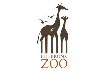
The Bronx Zoo
The placement of birds amidst the giraffes is a pretty clever way to make the viewer conscious of negative space… and then to notice the significance of the space between the giraffes’ legs. As you look more closely, you notice the homage to the Bronx in the form of iconographic buildings from its skyline.

(Image source: Somebody Marketing)
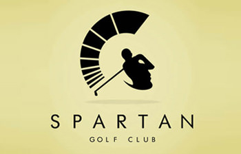
Spartan Golf Club
In this stately logo, not only does the action line emphasize the time-lapse motion of the golfer’s swing — it also establishes the iconographic helmet plume that the Spartans are known for. With closer examination, it becomes clear that the golfer silhouette can also be viewed as a soldier’s face in profile. Memorable, and à propos.

(Image source: Wikipedia)
Goodwill
Naturally, the Goodwill logo represents a smile — cropped in half. It’s appropriately indicative of the feel-good spirit of giving. It’s easy to view this logo repeatedly before you realize the import of the cropping; that same smiling face is what determines the shape of the “g” in “goodwill”.
Notice more?
This is one of our favorite topics: branding that makes sense, and which drives a point home in a clever and appropriate way. If you have other favorite examples, we love to hear about ’em!


0 Comments