These Three Hotels Are Going The Extra Mile In Style
Here at Skytemple, we get psyched when we discover a hotel or resort that makes an especially stunning visual impact!
Of course, it’s important to provide a space that’s clean and comfortable for your guests — no one would dispute that. But how important is it really to go that extra mile with cool, unique design themes and fanciful details? Especially if you’re trying to run a small or mid-sized business with limited time and resources?
“Extra” doesn’t mean unimportant or nonessential.
In fact, it’s just the opposite! “Extra” is what sets you apart from the competition as an establishment that is not only visually appealing, but also trustworthy. Believe it or not, guests will trust you more when they feel as though you’ve put a lot of thought and heart into making the space interesting and inviting. They feel a personal connection with you, and that is the foundation of trust!
Boutique hotels in general already have a pretty good reputation for doing this in the hospitality industry — which is why it’s that much more important to make sure your design game is on point. Here are a few ideas to consider:
Meet: color psychology!
We’ve all heard the tropes about color in interior design: Warmer, more vibrant colors like yellow and orange encourage high-energy and creativity. Cooler, darker colors like purple and blue facilitate relaxation and calm. But these ideas can be a bit simplistic. We’ve gotten equally calm and cozy feelings in spaces that used vibrant colors. It all depends how they’re used. Lighting and texture play significant roles as well. Studies have shown lots of natural sunlight to be a very effective happiness-booster. You can also evoke the culture and climate of your hotel’s location with creative use of different textures, be it with colorful, woven blankets in Mexico or light, gauzy curtains in the Mediterranean.
So, who’s doing this really well?
We’re glad you asked! Here are a few great examples from around the world.
Rosas & Xocolate: A Cool & Consistent, Yet Customized Theme
Yucatán, Mexico – http://www.rosasandxocolate.com
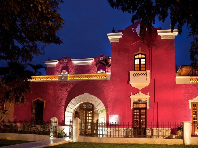
The folks at Rosas & Xocolate pride themselves on creating a “romantic atmosphere with distinctive features.” The way they want you to feel while staying with them is very clear in their design of each space. The exterior is a bright pink with clean, white accents, which gives off an invigorating vibe.


The colors in the actual rooms, however, are more muted with pops of patterns and the same bright pink carried in from the exterior. This makes for a more calm atmosphere for sleeping and relaxing. They also combine more traditional, wooden furniture with sleek, modern furniture for some seriously stylish comfort. You can find even more variations of these elements in the restaurants and spa.
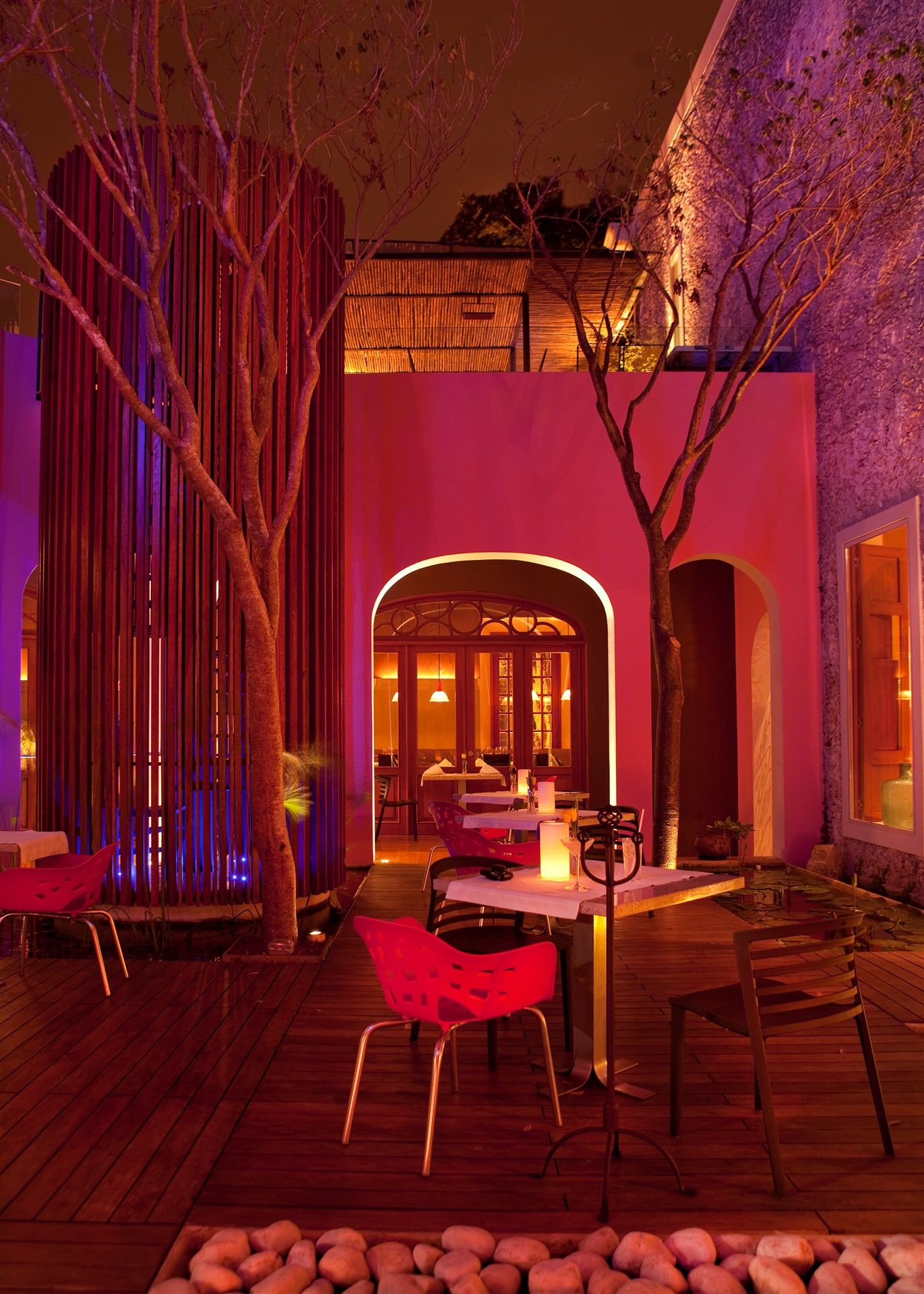
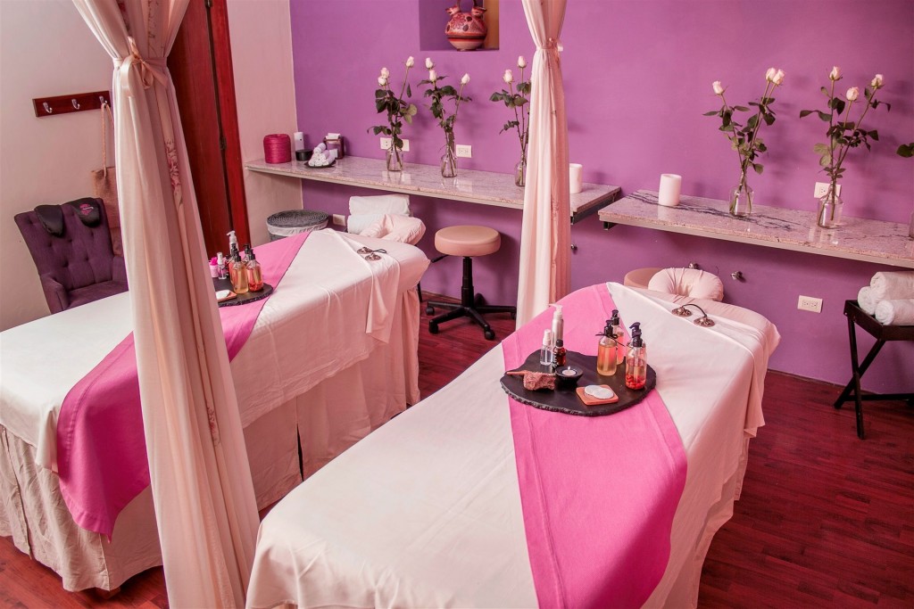
It’s the same concept and color scheme throughout the hotel used in very different ways depending on the needs of the specific space. This was SUPER well thought out!
El Fenn: A Luxurious Atmosphere With A Cultural Flair
Marrakech, Morocco – https://el-fenn.com


El Fenn is a palace-turned-hotel that definitely feels as regal as its roots! These folks did a fantastic job of bringing out the “spirit of the building’s past [with] a contemporary decorative twist.” They do this by highlighting the traditional Moroccan architectural elements with bright colors and modern pieces.
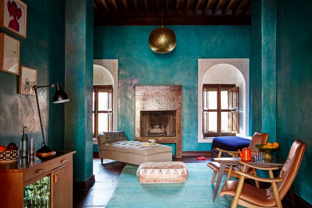
A perfect example is these turquoise walls and gorgeous window carvings alongside that fabulous, silver tile fireplace.
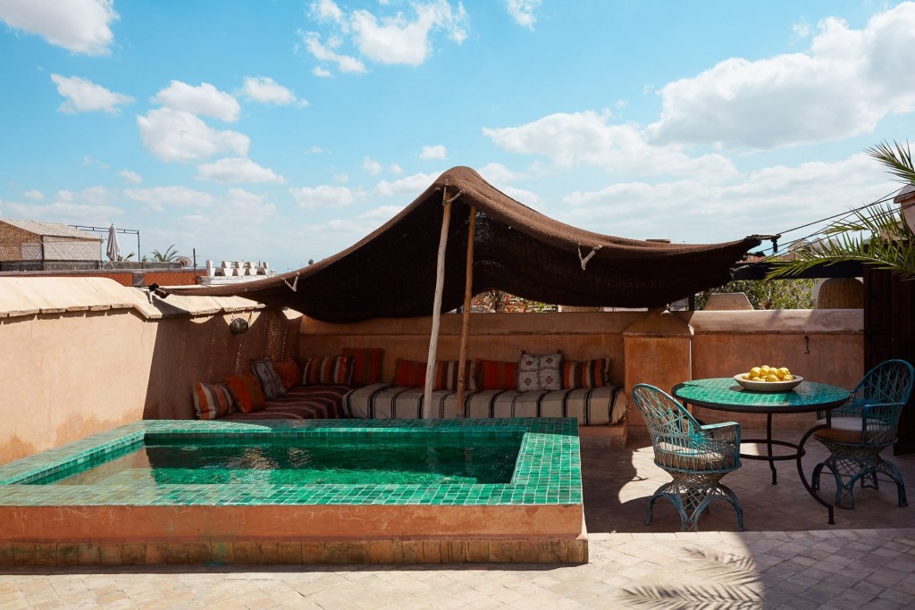
You can also see modern and traditional textures playing off of each other in this outdoor plunge pool space.
Super smart and stylish!
Los Enamorados: A Carefree Vibe With Quirky Details
Ibiza, Spain – https://www.losenamoradosibiza.com
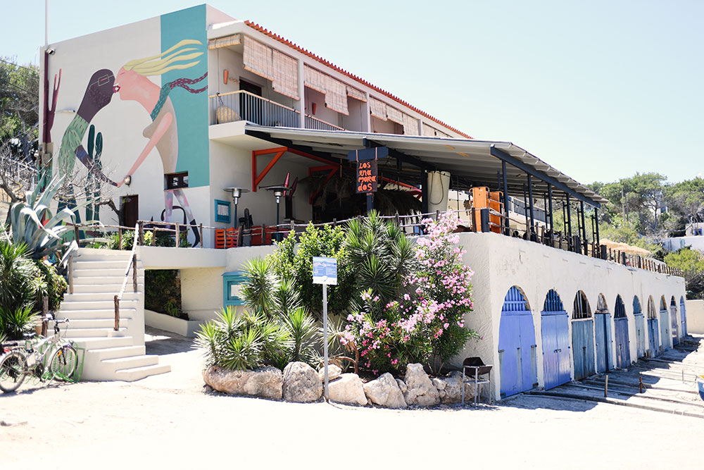
Los Enamorados means “lovers” in Spanish, and a passionate love of life is clearly evident throughout this small, boho-chic hotel! The murals on the exterior walls tip you off from the very beginning that you’re in for a fun, laid back experience.
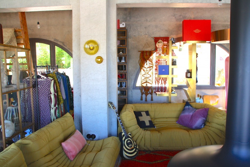
It’s all about unique details here, whether it’s a funky painted guitar leaning against a chair, or a crab-shaped pillow on your bed! Each of the 9 rooms has it’s own individual character, and you probably won’t find more than one of the same furniture piece or knick-knack anywhere. They also take advantage of natural sunlight throughout the hotel, creating the relaxing vibe of a stylish, island shanty.


You still get a lot of plush textures and warm colors too, and the entire design concept strikes the perfect balance between comfort and adventure.
The coolest thing about hotel design is that there are SO many different options and concepts that can be mixed and matched…and they still work.
There’s no specific formula to it, but it does take intentionality about what you want to say, how you’re going to say it, and keeping it consistent. The key is branding, and it’s especially true online, which is where most of your guests are going to meet you for the first time. Check out the hotels’ sites above. They paint some pretty clear (and inviting) pictures about who they are. They’re all very different, and they’re all rocking their brands!
Want some more individualized ideas about online hotel branding? We’d love to help!


Surprised to open this post and see Rosas y Chocolates featured – it’s just down the street from our new apartment 😉 The photo you’re missing is of the pool – it’s quite a feature.
That is so awesome! I would love to stay at Rosas y Chocolates sometime and see that pool!