We’re Kind Of In Love With These Magazine Layouts
It’s a weird time for digital magazines.
I mean, let’s face it: the last big shake-up came with the dawn of the printing press. The means of consuming media had pretty much plateaued until all these shiny new devices came along.
Here are a few of the online magazines that have handled the seismic shift of going digital rather gracefully.
Note: in this case, we’re talkin’ about magazines as they appear online, kiddos. Most also have an offering within apps/readers — a topic worthy of its own coverage at a later time, perhaps.
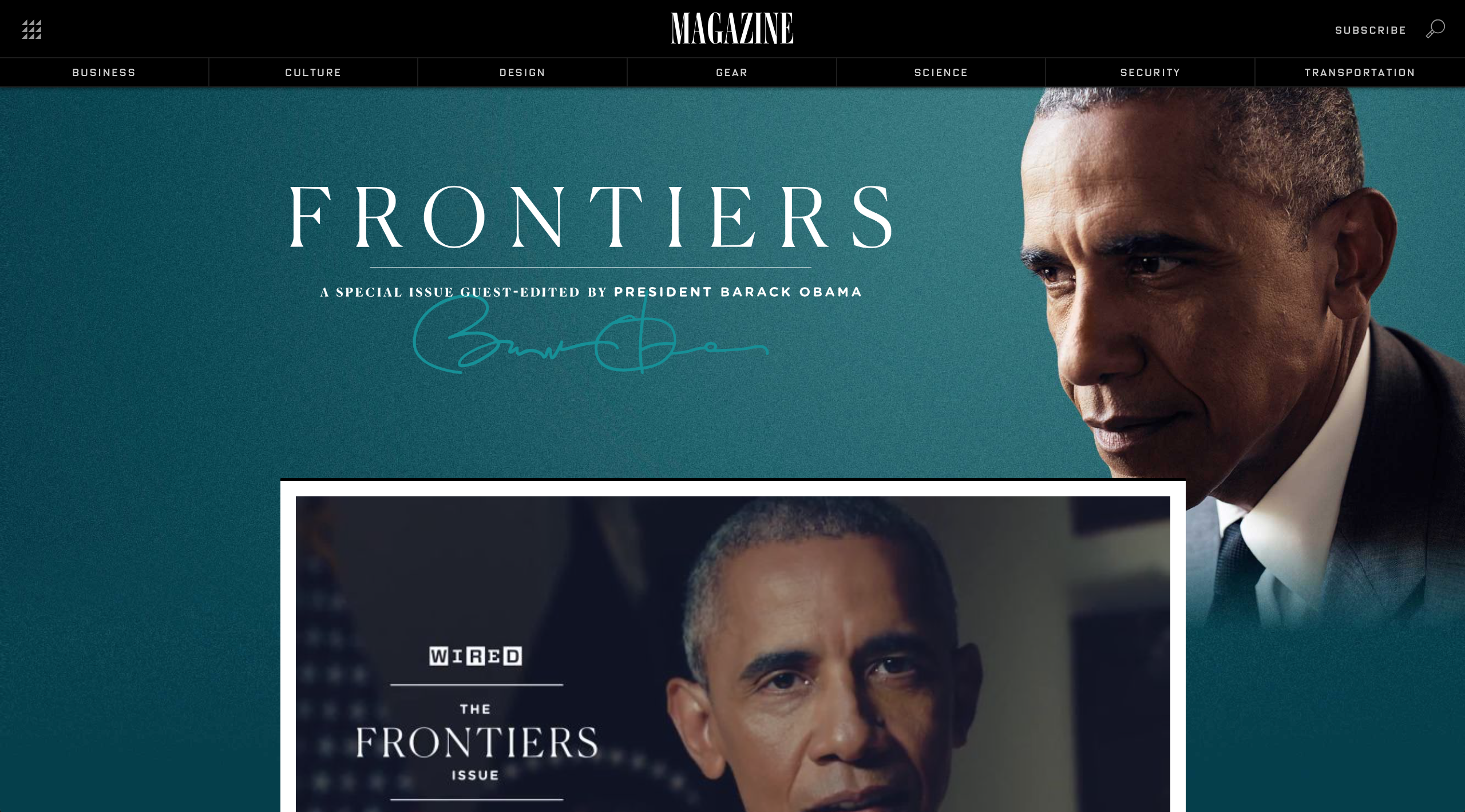
WIRED
Here’s one that had great design in the days of print, and — perhaps due to its techy subject matter — took on the digital challenge with gusto. These days they are doing a lot of things right. Upon load, a compelling video autoplays silently to draw your attention irresistibly down the page. They make use of the popular hero image trend in a fresh way; the thematic graphic slowly fades as you scroll down. Content is arranged in an attractive way, making use of the popular Pinterest card style, and weaving ad content in with everything in a way that’s not obtrusive.
As you might expect, you kinda need to see WIRED in action to appreciate the interactive layout.
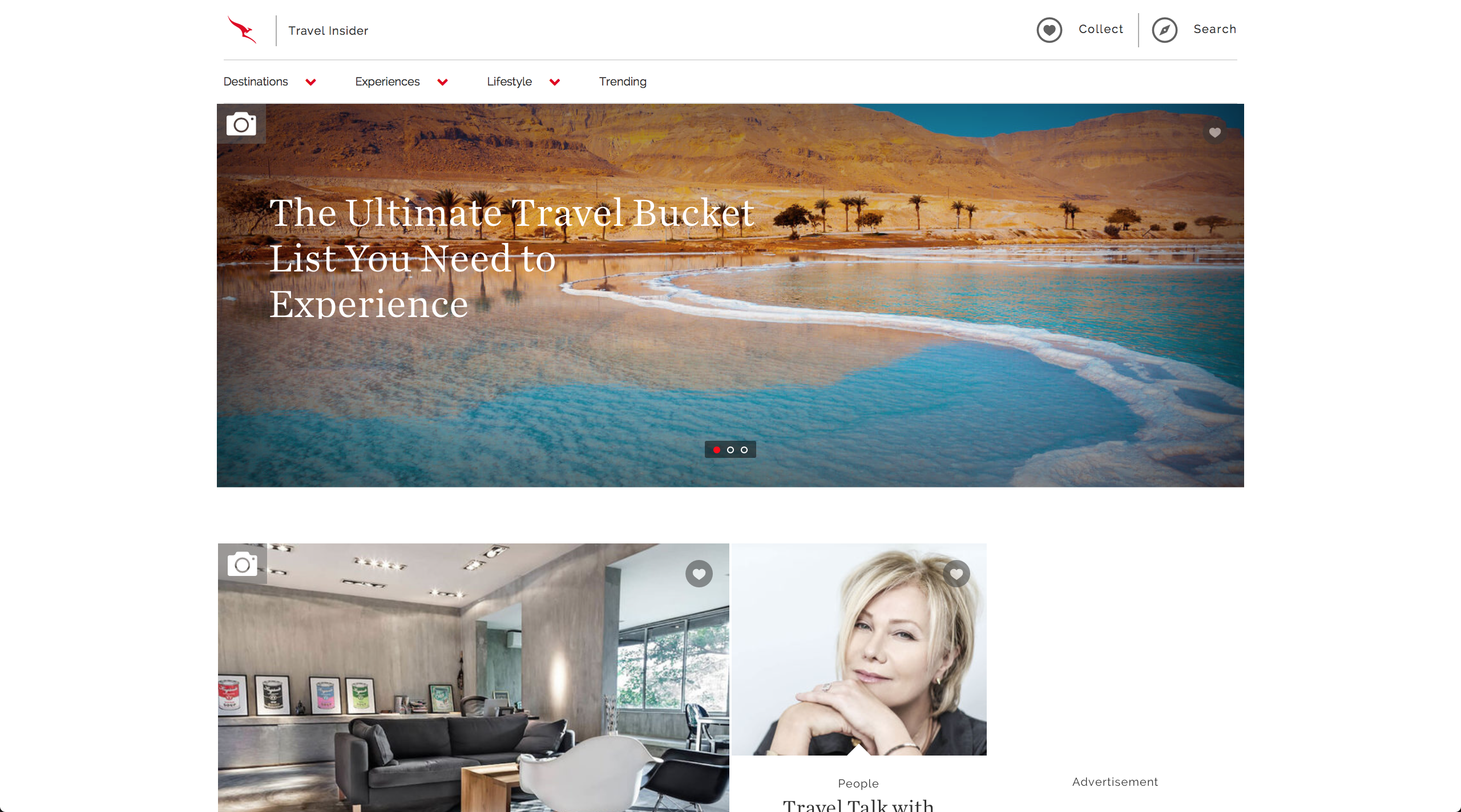
Qantas
“Qantas”? It’s okay if you’re wondering why you’ve never heard about this — we discovered it since it won DMA2015 for travel magazine of the year. This one has an elegant, simplistic style that’s quite approachable. There are icons for particular kinds of content (like the little photo icon to indicate that a post is gallery). There’s an enticing heart icon to collect favorites — which naturally compels you to create a login. It kinda helps that most of the imagery entails super-colorful paradise getaways, naturally.
Here’s Travel Insider by Qantas.
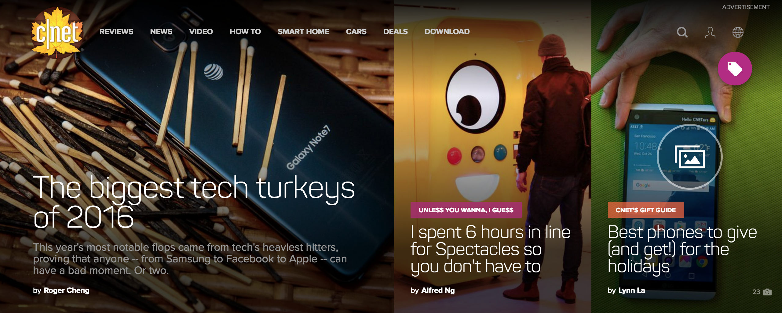
CNET
Just to get the downside out of the way: CNET is a bit salesy. But once you get into the content of this site, it’s journalism — and the layout and style of the reviews tends to be impressive. We like the clear categorization with icons in the sections such as Reviews. Stylish video headers appear for certain high-caliber posts. In posts comparing photo quality, a novel interface lets you slide smoothly between different versions of the same photo.
All in all, we’re impressed with CNET’s compelling approaches to help you feel and understand products before you even touch ’em.
Got more?
We certainly have a few zillion more favorites, and we like discovering more. These are a few that we found particularly worthy of discussion.
Happy browsing!


0 Comments