Best Hotel Websites In The Universe: A Paris Secret Revealed
Ready to spice things up?
Your website is probably missing a bit of that certain je ne sais quoi — and you probably know what we mean. When you take a fresh, honest look at your website as the first impression that visitors see… it doesn’t quite sizzle.
As we explore some of the best hotel websites out of the dozens that we’ve worked with, we certainly have our favorites. Hotel Design Secret de Paris is one of the best examples — not just because it’s sexy (which it certainly is), but also because it offers you some appealing, actionable ideas that you can apply to your own website.
To be clear: this is not one of our designs. But it certainly is one worthy of admiration, just the same.
Attract gazes with an alluring header video.
![]()
The smooth, seductive video montage that greets you when you visit this site is something to be admired. Various vignettes glide from one impression to the next, and things are framed with an intention of teasing: people and objects are cropped tightly, with undoubtedly interesting experiences just beyond the edges of the screen.
In a similar way, the hotel’s logo and branding are subtly splashed throughout, and its voyeuristic theme is apparent: delights are to be discovered just beyond the initial keyhole view.
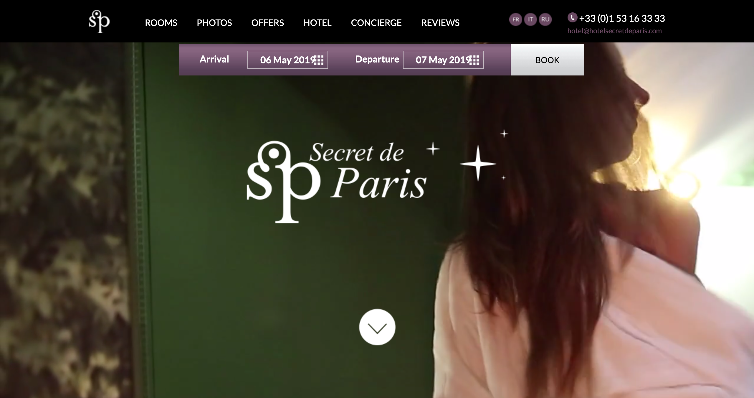
Certain moments in the video offer a particular allure that is unique to the hotel’s character, and it’s presented in a way that makes you curious to see more.
Video can be an extremely effective way to set a tone and theme for your site. It’s certainly worth exploring for that header at the top of your own homepage! Also consider a video that offers glimpses and impressions, since it allows you to overlay text and design elements without much conflict for attention in the design.
Make your thumbnails seductive, too.
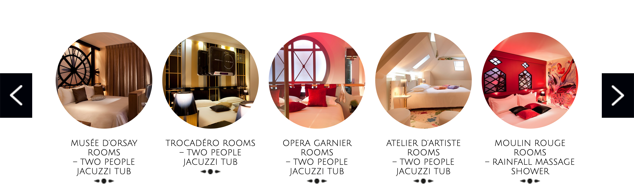
In keeping with the “keyhole glimpse” theme of the hotel, the thumbnails for each room show enough to give a sense for the design, but leave plenty to the imagination. Curious minds will yearn to explore a bit further.
Look at your own site: are there ways that you can crop things more strategically, to draw attention in a fresh new way?
Beyond the art of strategic cropping, the use of circles is no accident, either. Since a circle appears prominently in the “SP” logo of Secret de Paris, it is a reference back to the hotel’s brand.
To explore this for yourself, consider ways that you can play with your logo and branding to introduce fresh themes and visual elements in your own website.
Make sure those “extra” pages are showcased appealingly!
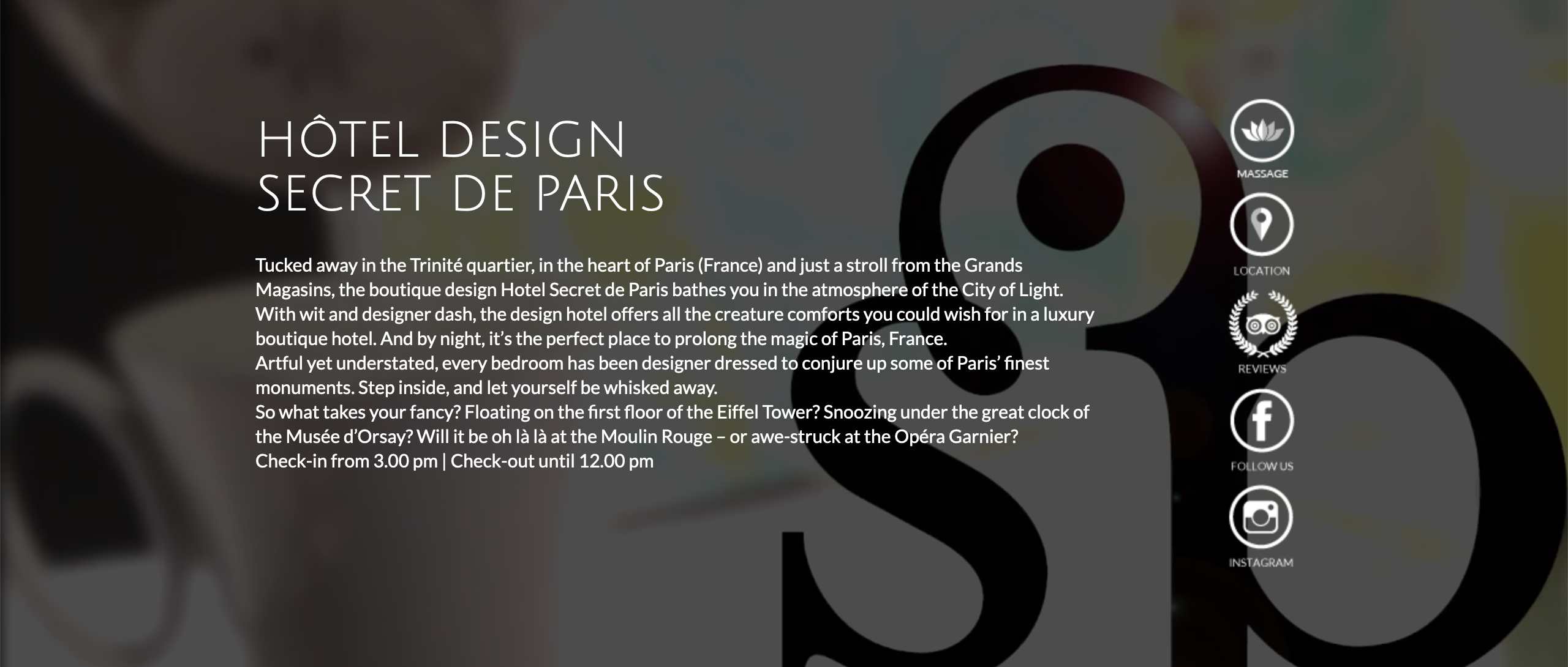
If you’re familiar with hotel websites, you know those “extra” pages we mean. Many hotels have spa, restaurant, yoga studio, or gift shop… and it is buried somewhere in the navigation collecting dust. In this example, some of the more prominent “extra” pages are showcased high up on the homepage in an eye-grabbing way.
How might you get some of those important pages out in front, in an way that commands more attention?
Consider putting that video element to use in multiple spots!
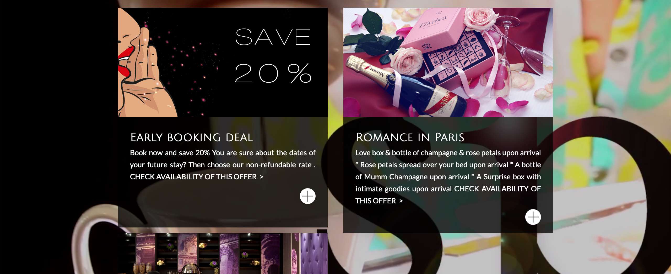
It’s like they say: work it if ya got it! The homepage for Secret de Paris certainly gets some nice mileage out of their video montage: not only does it show up in the homepage header, but it also appears again as a background further down the page. And in this case: it works, very nicely. The video is abstract and impressionist enough that it doesn’t steal attention away from the true focal point in this section: the special offers.
If you have a strong design element and it can work in multiple places, go for it!
The thumbnail style can add appeal to the photos page, as well.
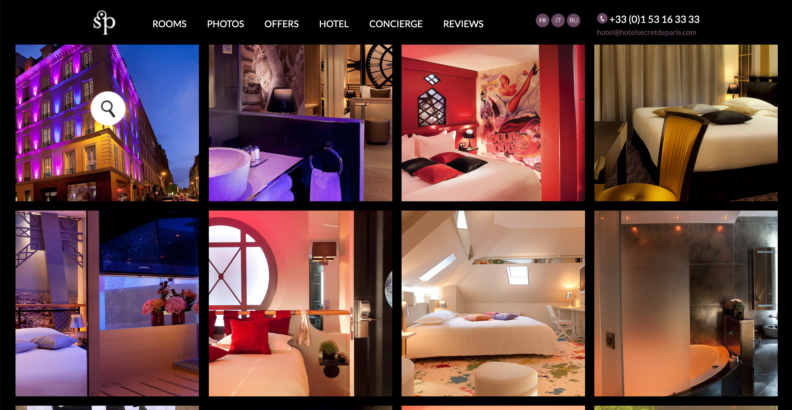
Taking their “keyhole glimpse” approach to teasing a bit further, the photos page also draws you in by cropping things photos tightly, in a well-designed way. Upon clicking, you are granted a wider view of the image, offering a rewarding experience as you browse.
Consider ways that you might make your image gallery more appealing. Thumbnails may be more attractive, and the style of interaction might be a bit more enjoyable.
Menu dropdowns can offer some sizzle, too.
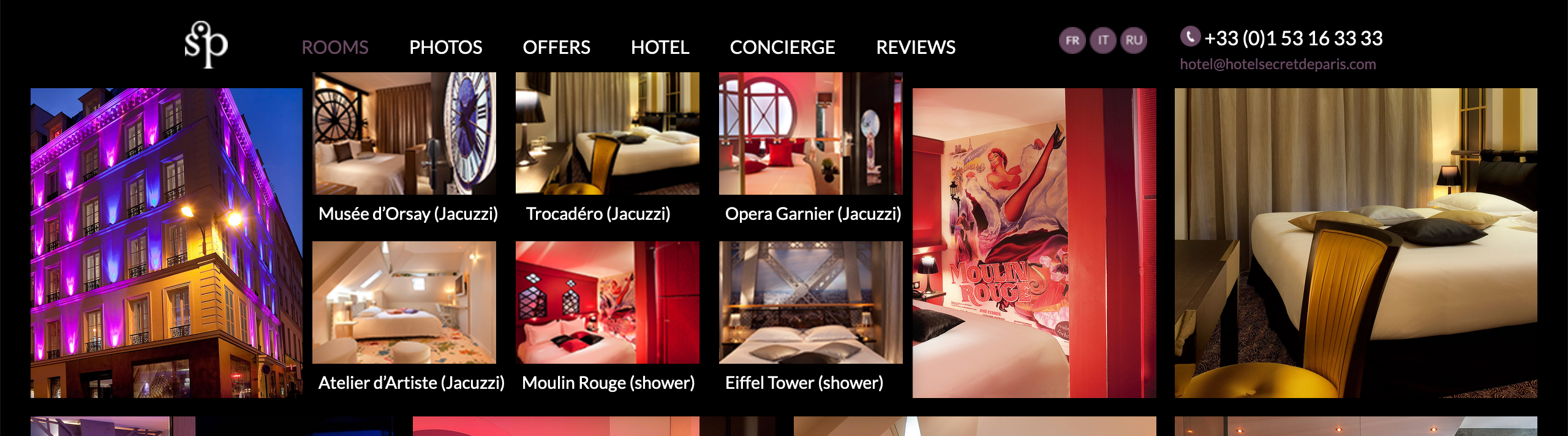
The menu navigation of a website can be more than just dry information — it can entice. In this case, the dropdown for “rooms” offers some photo thumbnails, and it really works to their advantage. For site visitors, simply seeing the names of the rooms doesn’t explain much. By showing visual snapshots, thee site offers additional eye candy as well as valuable information: you get an immediate sense for the style of each space.
Pretend that you’re a total stranger to your site and take a spin through it. Sit next to someone while they look at your site with fresh eyes. What might be explained a bit better with some photos, icons, or design? Take note: with improvements like this, you can look hotter and at the same time… get more results.
Give these a try!
Share these points with the folks who handle your website design, and your marketing.
If you’d like a candid review of your own website and marketing approach, we’re here for you, and we look forward to your message.


0 Comments