Why You’ll Love The Impact Of These Design Trends
It’s a really exciting time for design — especially in terms of what it can do for your impact and growth.
Sure, the aesthetic improvements are nice, but it would be a mistake to overlook the impact that these trends have on your bottom line as well! To help you learn about these trends and how they affect you, we’ve collected some of the most important and outlined them here.
We’ve shared the aesthetic impact of each trend, and highlighted the ways that it can help your conversion — so you can envision the improved clickthroughs, signups, and conversions of all kinds. Some of them we’ve worked on, sure — but mostly we just want to show off the great styles of the sites we love.
Also, don’t miss the complete checklist:
Want better conversions, with style? Then grab this.
To get the most of this, grab the full checklist (which contains all these items and more), and compare it with your own site. It’ll help you to actually make the improvements we describe here. (Then: enjoy better results on your site in no time.)
[convertkit form=4882860]
Now, envision your own website and consider how you could make use of these design trends…
Full-Width Hero Images
Luscious images that fill the full width of the screen — they have become the norm. Not only do they look great; they attract eyeballs. As folks check out your site, these images aren’t only making things look pretty — these images are helping people to digest information more easily. Placement of such images can do wonders for directing attention where it’s most important, whether it’s a signup form, a CTA button, your promo video, or whatever.
Sometimes you’ll hear the term “hero image”, and it entails a use of a full-width image that is of central importance. Though it seems to imply a person as the main focus, it doesn’t have to be. It’s the image that’s the hero.

A hero image establishes the tone of the site, and draws attention to main calls to action (CTAs), like this “find your home” button on Empty Nest NYC.
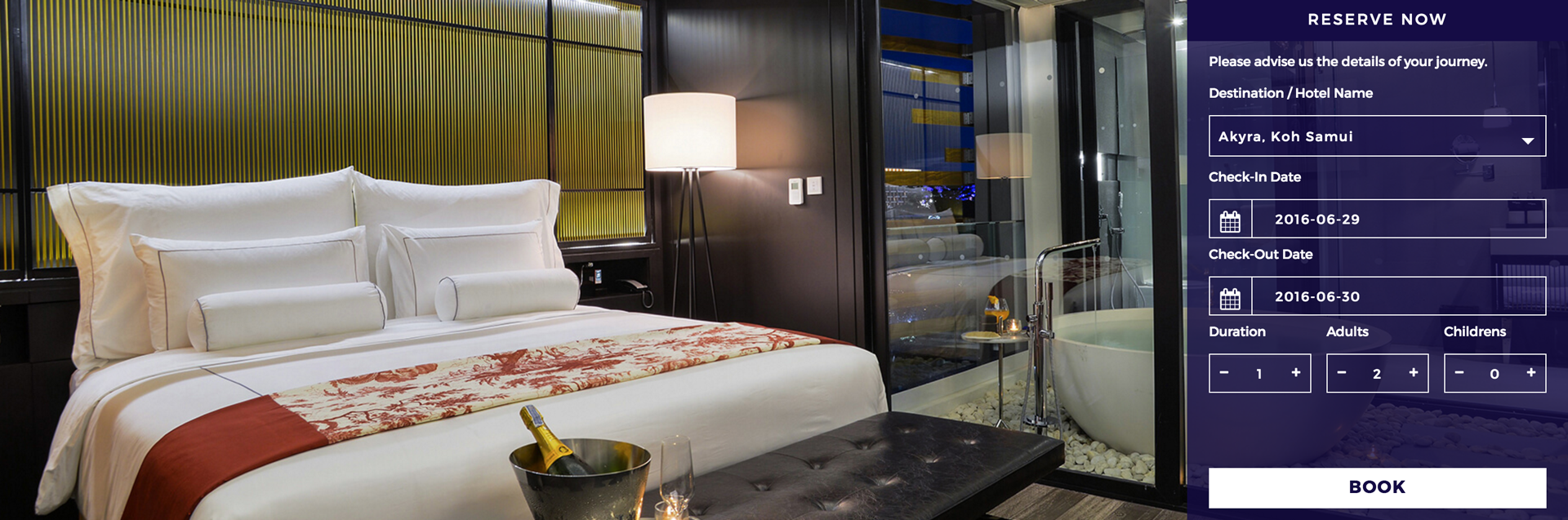
Hero images may not include images of people, but they work best when they are relevant and attractive — hopefully even inviting like the room at Akyra Chiang Mai.
Prioritized Navigation
You’ve got a central point of focus, so make sure everyone else knows it. Right up in your main navigation, you can style your main CTA as a high-profile button. It might be a different color, or could even stand out with its own unique appearance: a ribbon, badge, or graphic.
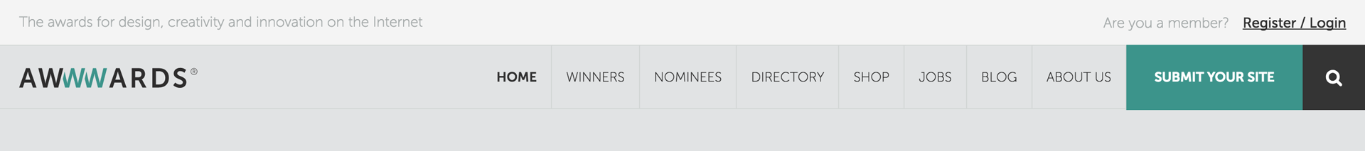
It’s pretty clear what jumps out of the navigation on the website for Awwwards — to submit your site!
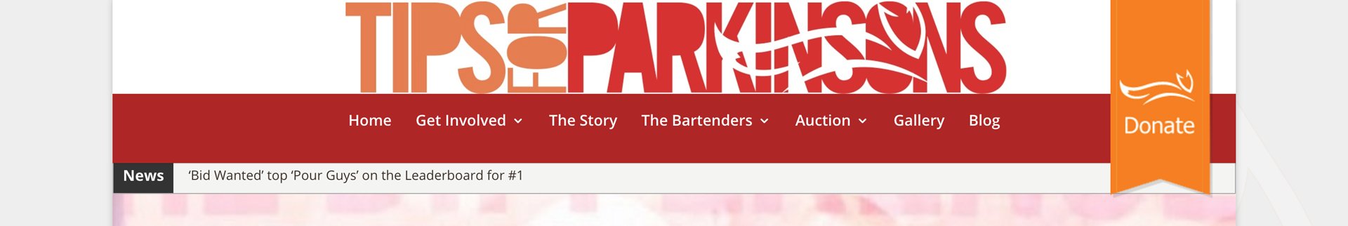
As in many donation site, the donate button is set apart from the rest of the navigation. It’s a ribbon in the example of Tips For Parkinsons.
Minimal Lead Capture
Keep it simple and reduce friction: present your lead capture in a minimal way. Users more likely to engage with something easy. You can always complicate things later by asking for more information after the initial lead capture.
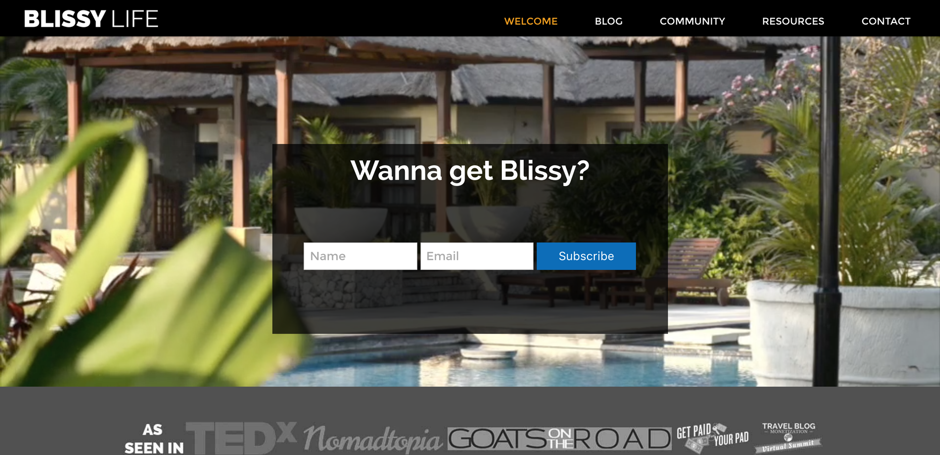
There’s no complication getting in the way of an easy signup on Blissy Life.
Powerful Video
When it comes to a rich experience, video offers enormous potential. Video works wonders in presenting tone and style, and depicting elaborate concepts. Video can serve well in the form of inline videos, and it can offer an engaging backdrop to a homepage.
The movement in this header is attention-grabbing, right at the top of the homepage for IAVA.
Responsive Design
You already know that responsive design makes your site look nice on any screen: desktop, tablet, phone, etc. Your site renders slightly differently based on the device it’s viewed on. Great! That’s nothing new, and this stuff is probably beyond a “trend” and more of a standard best practice. So beyond looking nice in a variety of formats, it’s nice to know that a few other things are happening as well…
Quite importantly: your site is loading faster. In a world of short attention spans, that means more attention from humans. And search engines love it too, so you’ll enjoy higher visibility in Google.
Interaction differs between devices, too. Consider use of a mouse compared with fingertip swipes, taps, and gestures. Content can be more readily accessible with smart responsive design.
This all boils down to reaching people, and making their experience easy and enjoyable.
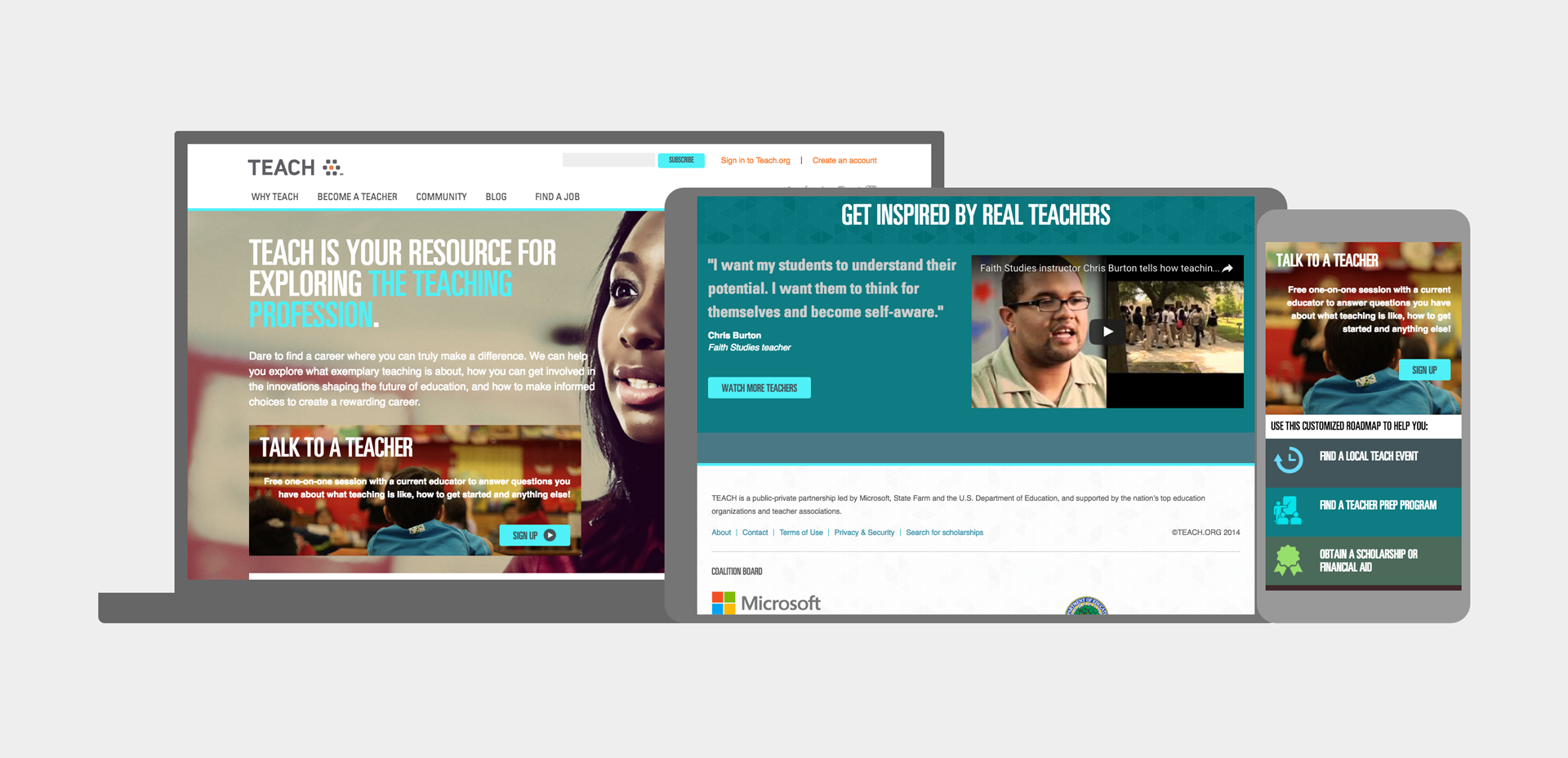
The content adapts your device — providing an experience that’s most appropriate — on Teach.org.
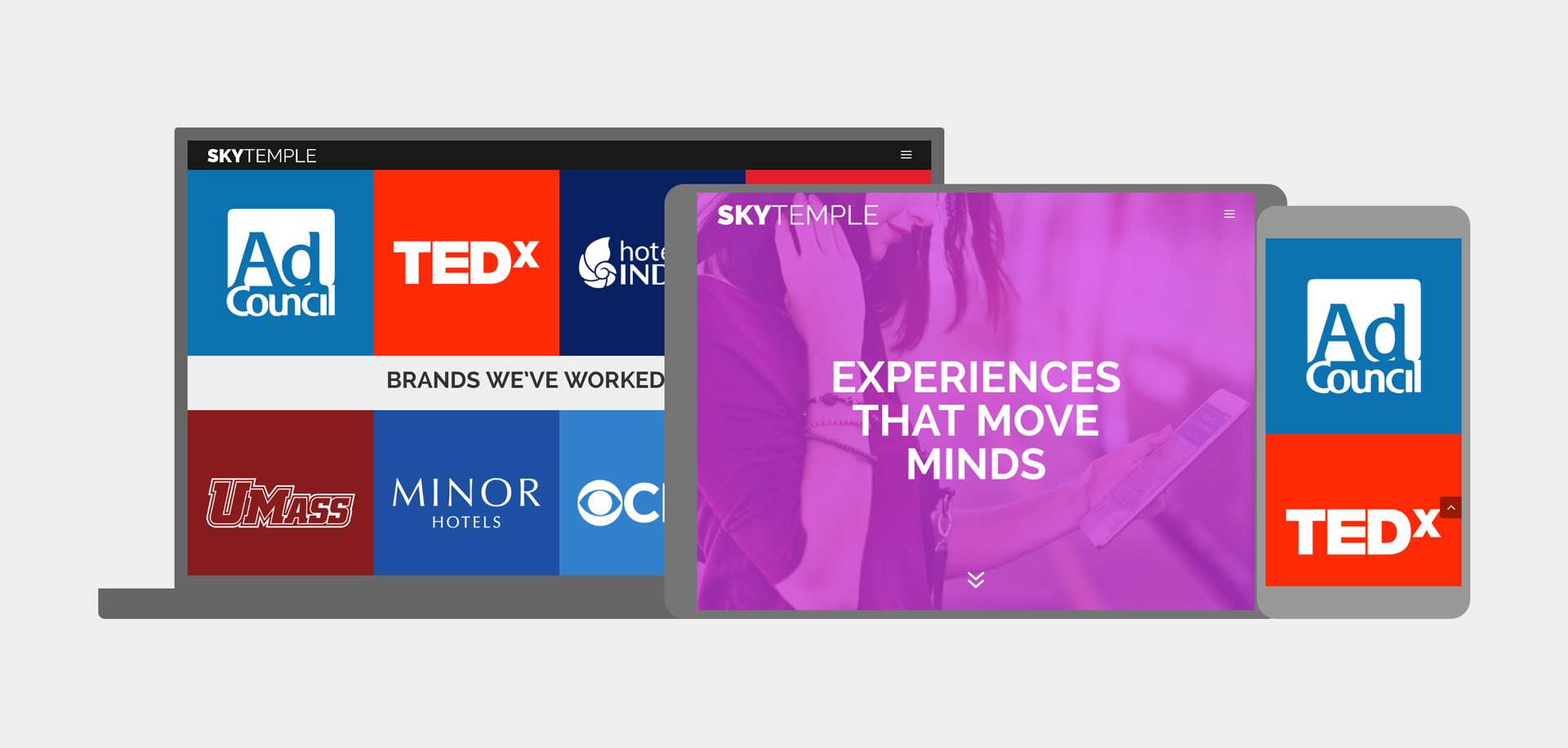
Content flows differently depending on your device — and some is even cut out, for brevity — on the Skytemple site.
Monochromatic Background
Sure, it looks cool. But if you think about it, this is also reducing the visual information considerably. A photo in a variety of colors could introduce all sorts of focal points to distract. When an image is reduced to a stylized, monochromatic graphic, it reduces distraction, bringing focus to the central content, or a CTA in a contrasting color.

Since the background image is monochrome, the colorfully contrasting CTA button really draws attention on the site for Nachman BioMedical.
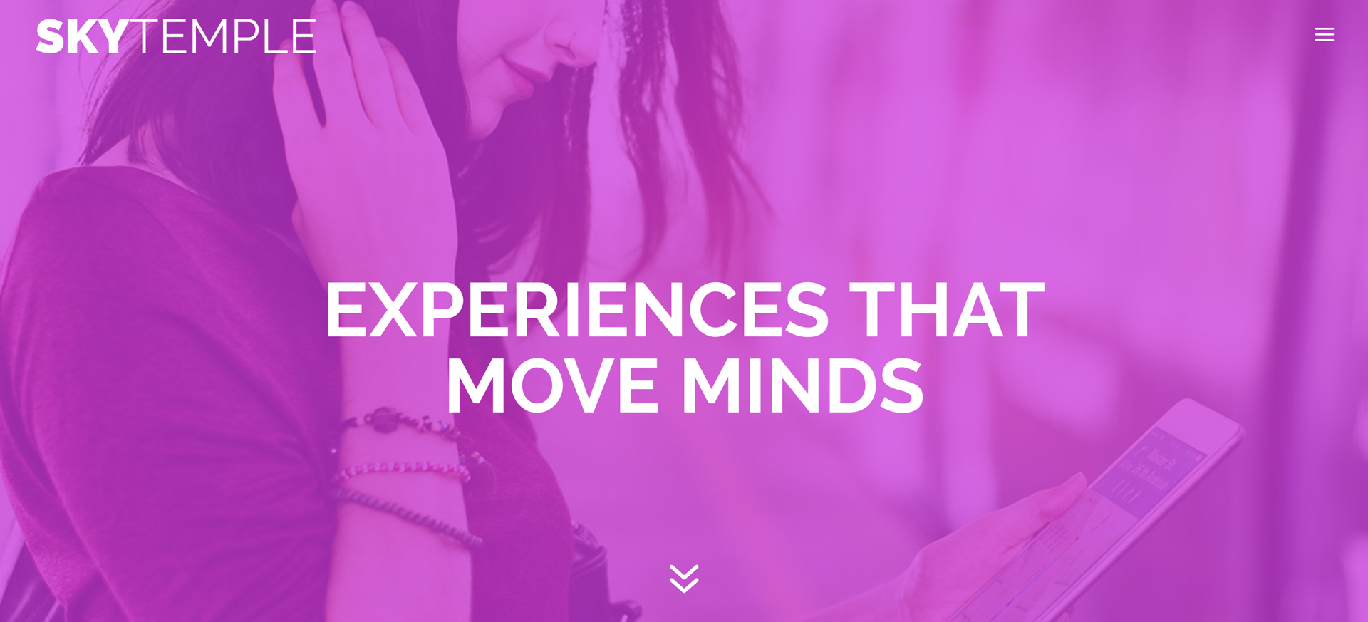
In this example, it’s the message that really stands out, thanks to the bold monochromatic image on Skytemple.
Card Layouts
Obviously Pinterest gets credited with popularizing this, though there’s more to it than that. As far as user experience goes, this layout does wonders for distilling information and condensing it into small, digestible content blocks. If it’s done properly, the entire card is clickable… or tappable. And that “tappable” element has ever-growing value with the prevalence of smaller screens as tablets and phones become more and more ubiquitous.
The colorful, vibrant portfolio panels fill your view and irresistibly draw attention on the site for Free Association.
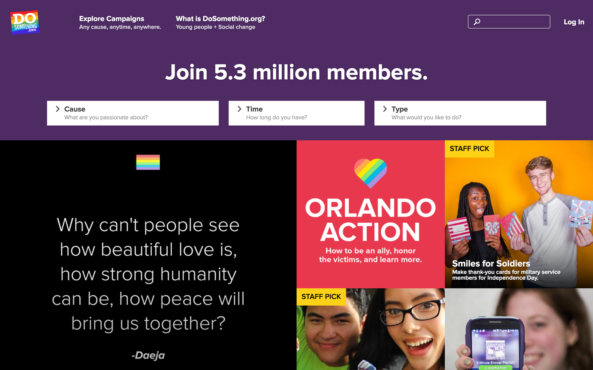
Content fills the screen in vibrant, clickable tiles on the site for DoSomething.org.
Material Design
While Google gets big kudos for articulating it, the beauty of material design lies in its awareness of what’s intuitive. It ends up looking extremely minimalist because it distills the core concepts of our visual nature and how we make sense of things. Though it may look more “plain” than the ol’ skeuomorphism trend (where objects were rendered to look almost like real-world physical items of wood, metal, plastic, that old way starts to look more like a compensation than a solution. Material design is grounded in making sense.
So: make sure you’re making sense. Make sure material design is figured into your digital strategy.
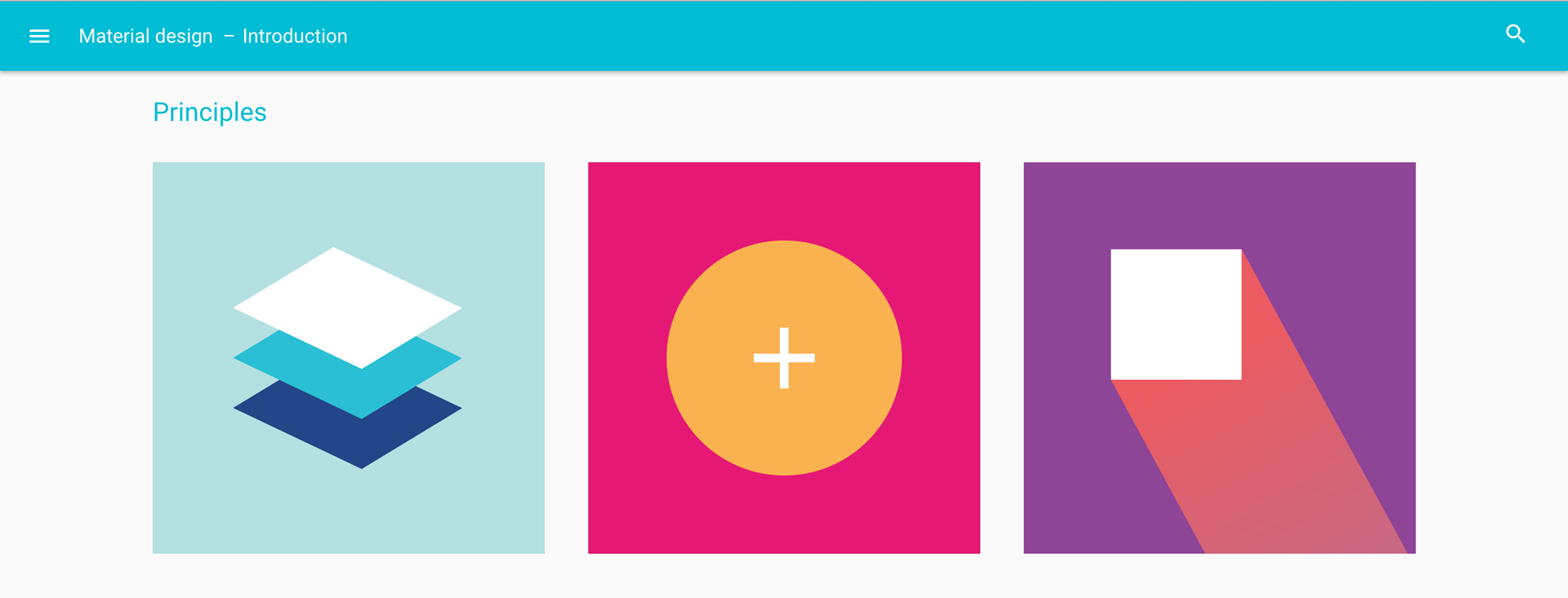
Naturally the principles of material design are applied in this guide by Google.
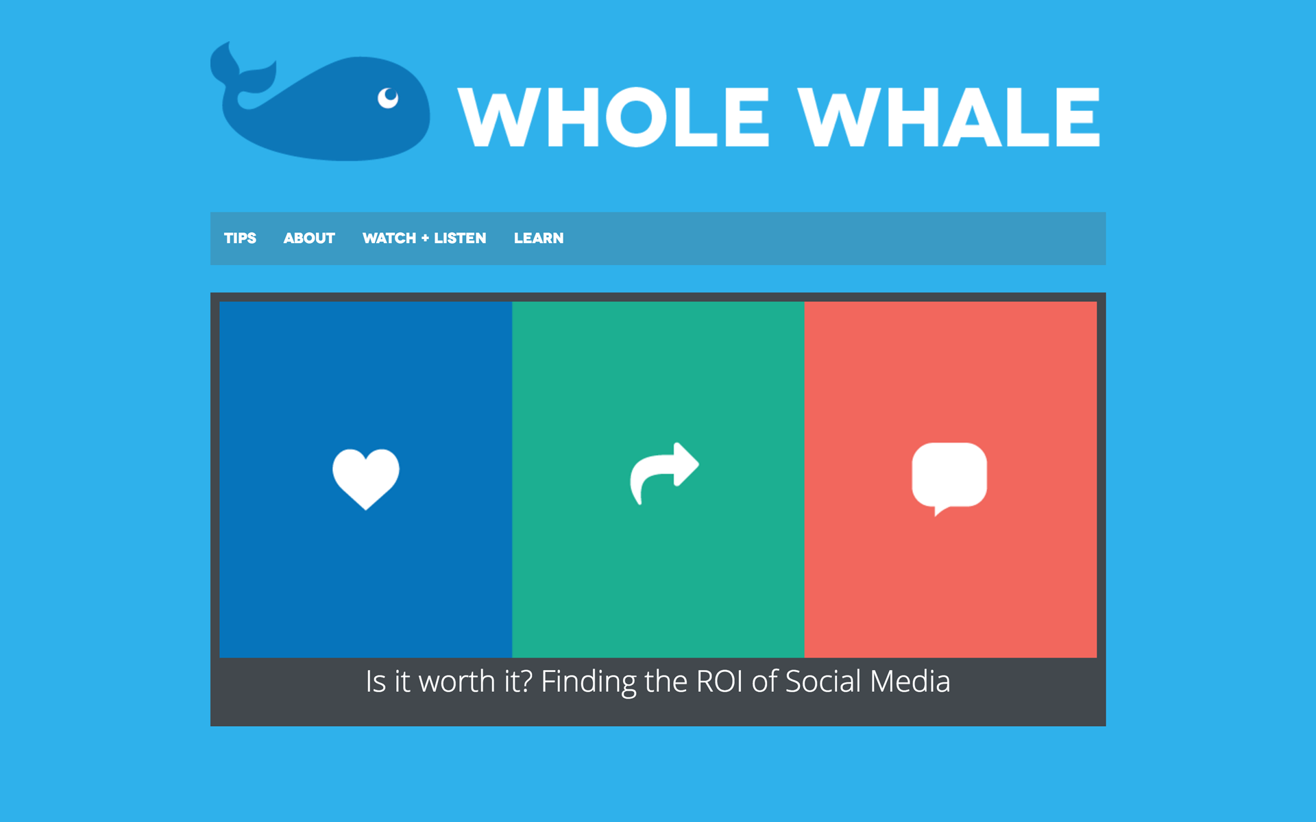
The lovable, approachable style comes across in this example of flat design found on the site for Whole Whale.
Don’t forget your own conversions, with style!
Grab the full checklist (which contains all these items and more), and compare it with your own site. Enjoy better results on your site in no time.
Just let us know where to send it.
[convertkit form=4882860]
Design Essentials, And Beyond
These are just some of the core concepts that you should bear in mind when evaluating your own digital strategy. So, congrats! You’re off to a great start.
To make this list easy to review, we put together the above checklist that contains all these items, plus a few more. You can easily scan through your own digital media and find places to improve — or just send this sheet to your CTO, digital marketing team member… or even to your friend who might appreciate the help.


0 Comments